How I designed a travel planning flow to assess seniors’ memory and planning, without a “test” feel?
Memory Miles
Overview
The goal of this project was to design a landing page that evaluates selected IADLs in older adults with dementia through a travel-booking scenario.
Instead of a traditional cognitive test, I created a realistic, step-by-step experience where the user plans and books a trip, while the product helps evaluate memory, time orientation with low stress and a friendly tone.
As a designer, I owned the end-to-end UX/UI of the assessment flow, working closely with a Business Analyst to define requirements and scoring logic.


Why travel planning?
Travel planning is a familiar, real-life scenario that naturally includes multiple IADL-type activities (Instrumental Activities of Daily Living) - everyday tasks that support independent living, such as managing time, organizing steps, and making practical decisions. Because the task feels “normal,” it reduces stress and helps us observe cognitive skills without a typical “test” atmosphere.


What IADL-related skills did we assess?
We used a travel-planning flow to reflect selected IADL-related abilities in a realistic, low-stress way. The scenario focused on:
Time management & time orientation (working with dates/times, sequencing steps)
Planning & organization (building a multi-step plan and staying on track)
Decision-making (choosing between options, comparing constraints)
Everyday transaction logic (reviewing selections, basic price/budget choices, confirming)
Practical logistics (transport/accommodation-style choices, summarizing before final confirmation)


Approach
At the start, together with the team, I mapped all user journeys and defined the test logic from required steps to possible end outcomes.
This helped us shape the experience as a quick “pre-test”: it was designed to detect signals of memory-related difficulties (and connected cognitive challenges) and support the decision on whether the person should be referred for further clinical evaluation for dementia (including Alzheimer’s disease) and possible additional care. Key assumptions:
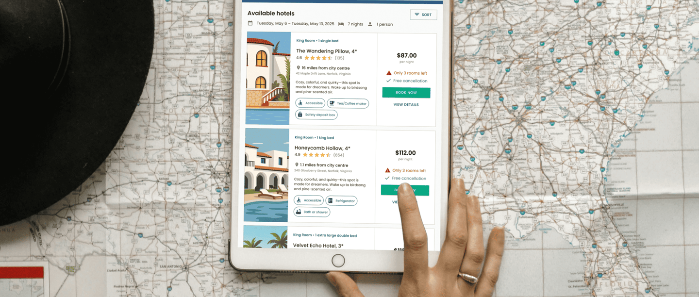
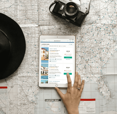
A realistic US travel-planning story, designed with a tablet-first, mobile-friendly layout.
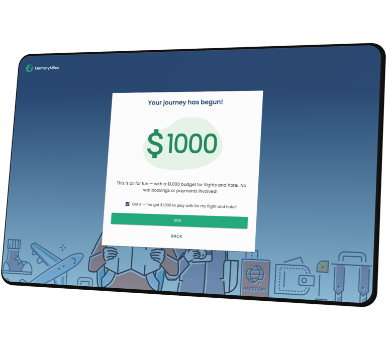
The task includes round-trip flights + accommodation within a total $1000 budget.
To keep airport choices believable, we used 50 real US airports and limited routes to East vs. West.
Users must remember their destination to choose the right accommodation later.
We defined decision points and success criteria across the full test (flight + stay) and used them to build a scoring scale with clear result interpretation.
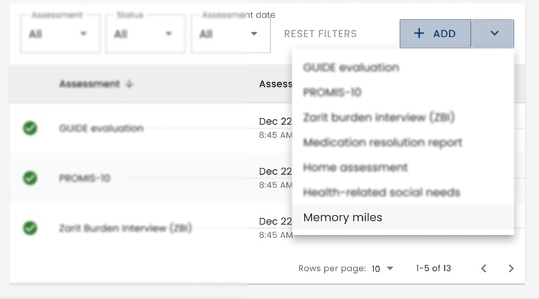
Patient-linked access
Users can complete the test as long as they have access to a link - this link is generated when the assessment is assigned to the user in an external health system. In that system, in the patient profile section all answers are gathered with the final score, making it easy for the care team to review results. The link is also accessible to external users coming from a marketing campaign.
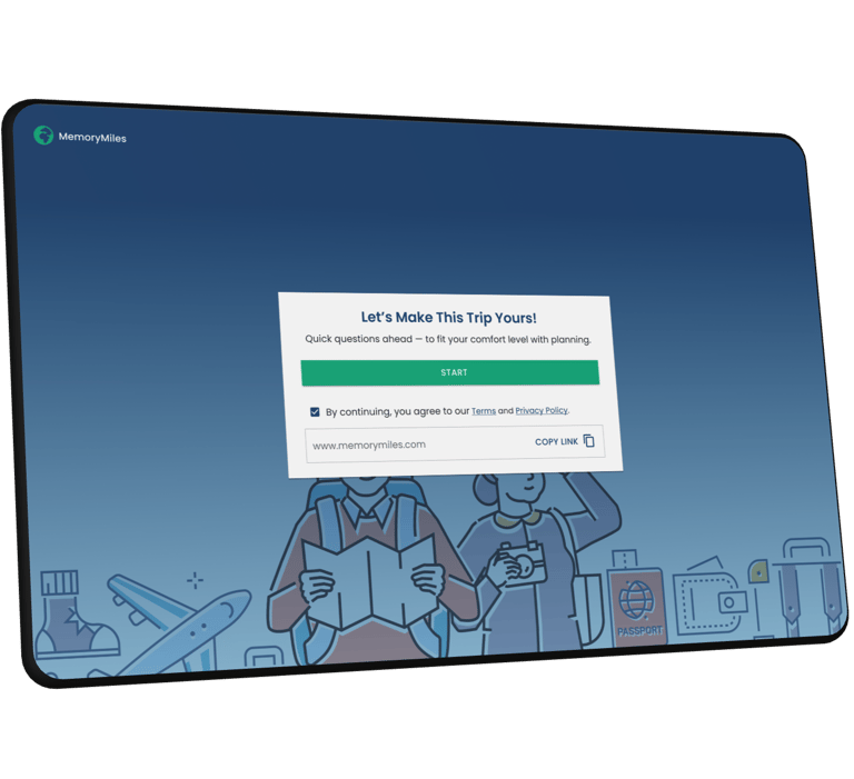
01 Entry & consent
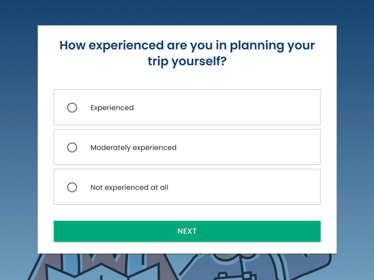
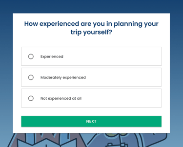
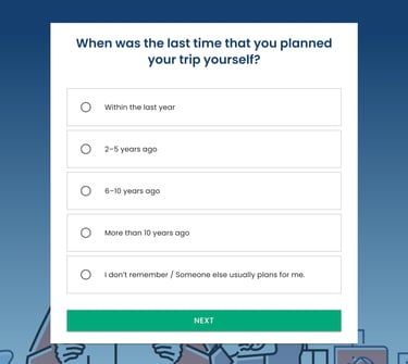
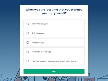
Baseline questions
Before users start the main flow, I included two short questions about their travel-planning experience and how recently they planned a trip. This gives a baseline for interpretation, so we can distinguish potential cognitive difficulties from a simple lack of familiarity with travel booking.
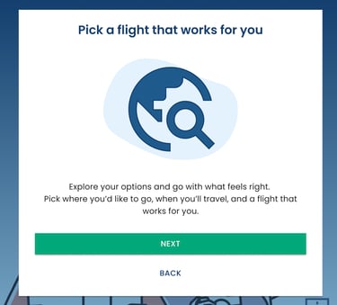
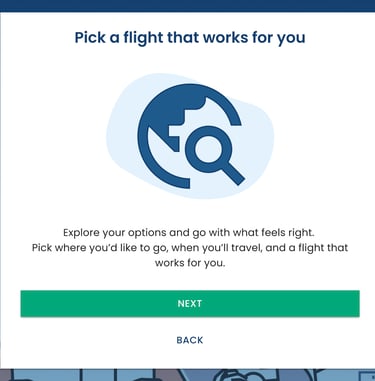
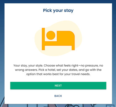
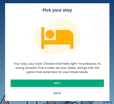
A quick warm-up before choices
I added two lightweight intro screens “Pick a flight” and “Pick your stay” to explain the upcoming steps in a friendly, low-pressure way.
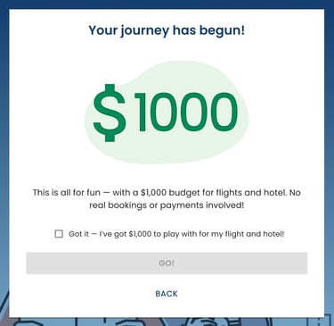
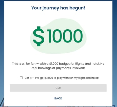
Then I anchored the flow with a $1000 budget gate - the “GO!” button stays disabled until the user acknowledges they have $1000 for the entire trip, because later choices (e.g., going far over budget) affect scoring and help clinicians interpret the final result.
What got shipped
I designed an accessible assessment that turns travel planning into a structured flow for observing seniors’ memory.


Filters and Sorting
I recommended enhancing the visibility of filters by adding more intuitive icons and brief descriptions of their functions, helping users quickly find relevant partners, such as by location or category. My goal was to make the filtering process faster and more user-friendly.
Expandable Partner Info
I suggested adding visual indicators, such as arrows or icons, in expandable cards to clearly signal that more information is available. This makes the section more interactive and easier for users to understand.


Pagination
To simplify navigation between pages, I suggested adding "Previous" and "Next" buttons next to page numbers. This helps users easily navigate through the partner list, especially when there are multiple pages.
02 Book your flight